Monday, 22 April 2013

evaluation

Through out the animation project I used different techniques and materials that help me lead to my final animation. The techniques that I used for the animation project was,
- stop-motion
- claymation
- animated GIF
- cartoon  flash animation/shape tween
- time-lapse animation

For stop-motion, I made a music video that is basically lyrics that was from the song that I chose, which was Daylight by Maroon 5. Also I made props that relates to the lyrics to the song. The other part of the stop-motion was I chose a food item which was tea, and I used the ipad to take shots of how the tea was made, before I made the stop motion video, I did a mind map of the food item that I ended up using.

For the time lapse animation, I used the observational drawing of the water bottle, and I used the ipad to take pictures of I drew the water bottle. The animated GIF that I have done was I did a slide show of historical buildings on power point because the subject that I chose for the animated GIF was history. After I had taken the pictures of the slide show I put them on Photoshop and chose how  many seconds the GIF was going to last.

I did my claymation video by making props of the setting of the song which was Uprising by Muse. I made the props such as the bear and the lamp posts by using play dough. Then I put the photos of the setting of the claymation video and put them onto iMovie. Afterwards, I dragged the song that I chose from iTunes onto iMovie. For the cartoon animation and the shape tween, I done both of them on Flash.  I first created the shape tween, by using the oval tool to create a oval shape ,then I  insert a keyframe. After wards I use the rectangle tool to create a rectangle. The effects that I use to create the shape flash animation by I soften the edges of the rectangle so that when I play it back it makes the rectangle into a circle. 

For the cartoon animation that I did on Flash was I create the layers for each part of the cartoon character , then I drew the features and the parts of the cartoon on each of the layer by using the shape tools. After that, I used the bone tool onto the legs of the cartoon, to try to make it move. 

The artist and designer that I researched for the Animation project, was Jamie Beck. Her work was the inspiration for the animated GIF because the way she movements but keeps everything still makes it look outstandingly realistic, by the way she takes still pictures and makes it into a mini clip of the still image.


For the brief of the animation project, I had to make an advertisement of a product of my choice. The advertisement could be related to music, fashion and food and create it by using at least one of the animation techniques. My final outcome did fulfil the purpose of the brief by doing drawings of the ideas for the final outcome and I also did mind-maps to help decide on the layout and the song choice for the animation.

For my final animation, I had decide to chose music because there so many ways to make an advertisement or possibly a video that relates to music. Before I decided to make my final animation as a GIF, but instead I made the animation as a stop-motion. When I was making the stop-motion animation, I realised that it looked similar to the pervious stop-motion that I made but both the drawings and the music was different. Most parts of the animation was hand drawn because it saved time to start making the animation. And also it makes the animation look original especially to the drawings I made on Photoshop. 

cartoon animation


I created my cartoon animation onto flash. The difficulties when I was making my cartoon character onto flash was, trying to make it walk with using the bone tool, but when I tried to make an attempt, it didn't seem that the cartoon wasn't look like it was walking. The other difficulty that I had when I was making the cartoon on flash, was uploading as soon as I was finished with it. I started to create my cartoon animation by creating a new symbol, then I added in the layers onto flash. After that, I started to create my cartoon animation. I decided not to join legs to the body of the cartoon because it was hard to drag the bone tool along the legs at times when I was trying to make it walk. The successful aspects of the animation was how the cartoon is presented altogether. But the aspects that I could improve on is, to follow the tutorial very carefully and trying to make the time to try to make more into getting the cartoon to walk. 

Friday, 29 March 2013

final animation


My final animation is a stop motion of hand drawn pictures of contemporary and street dancers and skateboarders, which I edited them on Photoshop before I put them onto i Movie  I also drawn pictures of skateboarders and dancers onto Photoshop. I decided to hand drawn the drawings of the dancers and the skateboarders on both cartridge paper and Photoshop instead of making props using different  materials because the process of making the video will be quicker that way.

I chose music for the final animation because there are different ways to express  feelings  and emotions through music.  My idea has change throughout the project by how I used Photoshop throughout the animation instead of making  hand made props such as , cardboard skateboard ramp because the timing into making the animation will take longer if I end up making all the props and the settings of the animation without using Photoshop.  The successful aspects of making the animation were sketches of the dancers and skateboarders especially the sketches on the computer. The improvements of making the stop motion video is to put a different song choice that relates to dancing and skateboarding.
The artists that I looked at help me to expand ideas of aspects of expression links into music, I also added in words that describes what both skateboarding and dancing is about.

Most of the dancers in the stop motion was mostly silhouettes that was made from black card brought out the background, the developments that I should have made is to add more of a suitable  backgrounds for somes of the hand drawn sketches or add a background to the drawings that does not much of  the settings of the animation and add more variety of colour towards the final outcome.
The skateboard ramps that are in the beginning of the stopmotion and towards the end, I found images of skate ramps that I chosen and develope it on Photoshop, so that it would easier rather than making skate ramps out of cardboard or other sources of materials.

Monday, 11 March 2013

final animation equipment list

The equipment that I need for my final outcome are;

  • cardboard- skateboard ramp
  • iMac-photoshop/ Illustrator- skateboarder 
  • watercolours 
  • tissue paper- music notes 
  • spray paint- music note stencils 
  • card- dancing/ skateboarding silhouettes, bars for the skateboarder, the love graffiti font, graffiti skull for the brick wall background 
  • poster paint/oil pastels- peace symbol 
  • black fineliner 
  • felt pens 

Tuesday, 5 March 2013

project review

The materials and techniques that I have experimented with during this project was learning of how to use Flash to create different types of animation such as shape tween and cartoon animation. Also I have experimented the different sorts of animation which were, stop motion and time lapse animation by using common food items and materials in limited amount of time. 
The skills that I developed during this project were, embedded videos on to Blogger and creating videos using iMovie. 
My use of materials and techniques was I used tea to create a stop motion of how was made and I created an animated GIF by using pictures that I took and Photoshop. The animations that went well were, the animated GIF, the stop motion and time lapse animation. The improvements that I could make in the animations that I did so far is to extend the time of my stop motion lyric video and add developments to the cartoon animation. 
The problems that I have with my use of materials and techniques were, creating the cartoon animation on Flash and especially trying to add effects to it for example, trying to make it walk. And the other problems that I had was completing the claymation video with the play doh. I overcome my problems by, using the pictures that I took for my claymation and make the timing accurate to the song that I chose. Also I tried to make attempts to complete the cartoon animation. 

I created my animated GIF by using pictures that I found of historical buildings for my background of my GIF, also I took pictures of poses of myself behind the slideshow of the historical buildings which turned into silhouettes of myself and I added timing to animated GIF by using Photoshop. I created my stop-motion lyric video by taking pictures of the lyrics of the song that I chose which was Daylight that most of the words was handmade, then I put the pictures onto iMovie. After that, I added the song for my lyric video onto iMovie. For my time lapse video I used an iPad  to create a video of stages of how I did my drawing observation of a water bottle. For my claymation video by using play doh and iMovie. The video is based on the song that I chose which was uprising. For the shape tween I used Flash to create effects by making one shape into another. My preference  will be the animated GIF because the stages of making the animated GIF is more simpler  than the other animation techniques that I have done through out the project. 

Monday, 4 March 2013

animation inspiration


Google - Martha Graham from Ryan J Woodward on Vimeo.


The animation video was by Ryan J Woodward, the video is called Google-Martha Graham. The  animation was advertise by Google, the idea behind the animation video was the contemporary skills and techniques of the dancer and choreographer, Martha Graham. I selected this animation video because it related to the theme of the animation video that I am creating. The video is inspiring by how the artist creates different movements of the dancers in the animation video and started to create words which makes into one word. The animation that was created in this animation was cartoon animation. The techniques that was included in the animation was Flash and Photoshop and sketching of the dancers in the animation. The ideas that I can try from the video is to include movements in the dancers and the skateboarders and include colours that contrast the elements towards the video such as the skateboarding scenes will include bright colours and interesting graphics for the skateboards and possibly graffiti. The dancing scenes will include light settle tonal colours with a blend of darker tones especially when it comes to the silhouettes of the dancers.

stop motion: daylight


I created the animation by making hand-made letters and pictures that showed the lyrics from the song that I chose which was daylight. I used different materials to produce words from the lyrics of the video, for example, I produced the word memory out of cotton wool and blue felt as the background which creates the illusion that the words are in shape of clouds. Also I created the word beautiful by using tissue paper as flower petals. The parts that went well are the way I used different sorts of materials to create the different styles of fonts that linked in with the lyrics of the song. The parts that I could improve is to make the video start at the same time as the song.

claymation -uprising


My claymation is based on a music video on a song that I chose which is called Uprising. The materials that I used to create my claymation was play doh. I used the play doh to create different props that related to the lyrics to the claymation video the improvements that I want to make to the video is make timing of the video longer by taking more pictures of the props of the claymation video. Also I want to change the position or layout of the props so that will take the pictures in different angles.

flash animation - shape tween


The techniques that I used a flash animation of making on shape to another was in flash. I first created the shape animation by using the oval tool to create a oval shape then I  insert a keyframe. After wards I use the rectangle tool to create a rectangle. The effects that I use to create the shape flash animation by I soften the edges of the rectangle so that when I play it back it makes the rectangle into a circle. To improve I should add more effects to the flash animation so that the animation will last a bit more longer  but at the same time the seconds of the animation should appear a lot quicker towards the beginning of the shape tween. 


Saturday, 23 February 2013

final animation ideas

My theme for my animation is music and my video is based upon the lifestyles of dance and skateboarding. The dance styles that i chose are contemporary and street dancing, the type of animation that was the animated GIF because it creates a interesting video between the different lifestyles or elements of both skateboarding and dance. The techniques that I will include in the animated GIF is photoshop because I wanted to dancers and the skateboarders look realistic.
This is the mind map of ideas of my animated video, even though it doesn't look really clear it shows the ideas of how the animated is going to appear. It also shows what the advert is aimed at which is young teens aged between 13 to 18 year old. The advert is also aimed people that have of either dancing or skateboarding. 


These doodles shows the ideas of my animated video. I decided to do two pages of ideas of the video, one page are the doodles of people on skateboards and drawings of the skateboarding logos and the other page is drawings of both contemporary and street dancers also I wrote down words that represents dance in a graffiti font. The reason why i did two separated ideas is because when i make the video it shows a story about life and how people take their talents like dancing and skills such as skateboarding and making it come to life. 
This storyboard shows how the animated video is going to appear and the story board shows a slideshow of the aspects of dancing and skateboarding. 

Wednesday, 6 February 2013

Animated GIF


I created my animated GIF by taking pictures of the different historical buildings and then created the animation on Photoshop. I edited the pictures on Photoshop by adding the photos on to a different layer, then I put the photos and placed them in the animation where I started the animation or a slideshow of the pictures that I took. Finally I set the amount of seconds of each picture, the amount of seconds that I set was 0.25 seconds. My animated GIF looks really effective by the way my silhouette stood out from the historical buildings. What works well are the silhouettes of the pictures which gave the impression that the form of my silhouettes look like a tourist. The artist that I looked at and researched is Jamie Beck. The parts that I could improve is to add props to the pictures so that it will actually gave the impression that my silhouettes will give into a form of tourist.

inspiring stop motion


Address Is Approximate from The Theory on Vimeo.
I chose this video because I like how the person that created the stop motion video who is Tom Jenkins used  different locations from the computer and toys to make the concept of the world's tiniest police chase. This video is inspiring by how Tom Jenkins use innovative and unique ideas for the stop motion video especially the part in the video where background on the computer change to a bridge and make the animation look like the toy is driving underneath the bridge with using the toy car, also the lamps that created a spinning movement looked like police sirens. The type of animation is a Google street view stop motion, the props and techniques that he used are mostly toys and Google street view. The techniques that he used were taking pictures of the places from Google street view which created an illusion that the toy was the driving the toy car through the places that were shown on the computer screen. The things that I could try in my own work that is inspired by the video is to create an unique outcome that links towards the lyrics for my stop motion video and create an illusion or a movement in the text which will make the stop motion video interesting and in timing with the song that I chose for my stop motion video.


Nowhere Near Here from Pahnl on Vimeo.
I chose this video because I like how the video took a creative approach of a dog running in the city of London at night. This video is inspiring by how  Pahnl took so much time and dedication into making the video which turned to an outstanding outcome. The props and techniques that he used into making the stop motion video are, stencils and exposure photography, the way he uses the techniques in the stop motion video are he drawn stencils of the animals that he chose for the video and then he creates light in the stencils by using exposure photography. Which makes the stencils look like bright illuminate cartoon street art animals.The things that I could try in my own work that is inspired by the video is to add bright colourful photos in the middle of my stop motion video so that it creates a different outlook towards the final outcome of the stop motion video.

The PEN Story from PENStory on Vimeo.
I chose this video because I like how the pictures became into a movement that made it look like the photos from the stop motion video came to life. This is inspiring how the pictures tell a story which made the pictures look live like, the props and techniques that have been used in the video were that the pictures from the video was shot each time to create the movement of the photos which gave the video a realistic form. The things that I could try in my own work that is inspired by the video is to take pictures of the text that I created for my own stop motion video and add creative techniques to them so that the video will turn out original yet unique.

Monday, 4 February 2013

stop-motion comparison


Death Cab for Cutie - Little Bribes from Ross Ching on Vimeo.


Hudson - Against The Grain from Dropbear on Vimeo.


The artists who created the stop-motion animation videos uses a range of different props or materials that relates to music or the concept that the music is playing in the background of the two videos. The artist that created Against The Grain experimented with using colouring pencils, the artist use of the materials relates to lyrics by the way the artist used the colouring pencils in many different ways such as, the movement of the waves with the pencils and how the artist uses different colours of the colouring pencils that represented the use of lyrics of the video. The artist that created the Against The Grain video is Jonathan Chang. The artist has used the techniques effectively by how uses the colouring pencils to creates a different prescriptive each time which creates a outlook of what the video is about. I don't like the video as much because the artist should use others ways to express what he is feeling through the lyrics of the video by using different materials or techniques.

The artist who created the Little Bribes video is Ross Ching. The techniques that he used to create the video was time lapsing each still shot of typography that he experimenting with by finding objects or places to write the typography. The artist has used the techniques effectively by how he uses the cityscape for the background and the main source of the typography also the way the artist makes the video is the way he uses the different sorts of styles of fonts for the typography. Also he uses his use of props to make words from the Little Bribes video which makes it look uniquely different. Also he uses them to represent the cityscape at night, I like how uses different places in the city to create the different types of typography which creates the uniqueness of it.

Friday, 1 February 2013

food animation -tea


The items that I used to create the animation are tea bags and nuts. I used iMotion to create the concept of the animation, I used the tea bags to create the theme but also using to create the teapot and the cup, I also used nuts to create the illusion that the tea is pouring from the teapot and into the cup. Before I created the animation I created a mind map of ideas of the food items that I chose. I created the iMotion animation on the ipad. I enjoyed using these techniques because with iMotion I can use the items that I chose and create different types concepts and making into one concept when it is put together. My idea of my chosen food item is effective because the food item that I mainly chose is tea can be made into many different ways but the concept that I chose shows how the tea has been made or produced. I can improve my animation by adding features to the tea bags so that it will had a sense creativity towards the animation.

time lapse animation


My time lapse animation is effective by how the speed of making the process of drawing of the water bottle is done at the short amount of time. The materials and equipment that I used are, oil pastels, iPad and card, the technique that I used to create the time lapse animation of the drawing  of the water bottle is iMotion. I liked the use of techniques by how each picture that I took from the iPad and it turned into a process of drew the water bottle from my previous drawing of the water bottle. The parts that I found difficult was taking the pictures of my drawing whilst I was drawing the image of the bottle.  I would like to work on them again but I would use different materials to make the animation more creative and presentable. 

Monday, 7 January 2013

final t-shirt outcome

This is drawing that I done that I began to get fully developed on Photoshop.  The changes that I made to the final outcome was, I set the colours for the background in a darker tone so that waves and the surfer silhouettes will be the main focus of the design. I add a white thick line across the background of the design so that it look like a tide of a wave, I used the paint brush tool to create thin lines around wave of the design. Also I changed the font of the design because it relates to the theme or the concept of the design. 
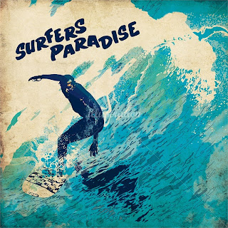
  My t-shirt is aimed at young teens who are interested in surfing or enjoyed doing surfing for a living or a hobby. I chose this  design because the colours are not too bright which makes the logo of my brand stand out also I chose this design because the two surfer silhouettes shows that the design appeals to both young male and female teens. The materials and techniques that I used were fine liner, colouring pencils and pens to create the t-shirt design and I used photo shop to develop the t-shirt design a bit more further. I took one of flowers from the design and create a halfway boarder around the design so that the logo will be the main focus of the t-shirt outcome. To make the design a bit more developed or improved is to add more colour around the background and the silhouettes of the design.  The artist and designer that inspired me is Chris Ede because the way he uses different techniques and materials helped me develop towards my final outcome. The comparisons between the Chris Ede illustration and my final outcome is the dark tonal shades around the waves but the differences are the Chris Ede illustration has a simmery reflection of the surfer whereas my final outcome has a solid silhouettes of the two surfers.


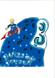
 I used my first logo as my inspiration because it was an development from the first logo to final outcome that a chose for my t-shirt design. I also developed my first logo by adding the female surfer but I made the female and male surfers into silhouettes. The other developments that I made from my logo design was, changing the waves into a different shade of colour but lighter because it drawns in to the details of the waves and the boldness of the background of the design. The differences between the development of the Blazzing Bonzer logo and the original logo is, I changed the font of the developed logo so that it relates the theme of the brand of the logo and I made the tide of the waves look faded because I wanted to make the texture of the waves a bit smooth and settle. The similarities between the developed logo and the original logo is I kept the tide of the wave in shape of a b because it is the initials of the logo.