Thursday 22 November 2012

chris ede inspired t-shirt outcome

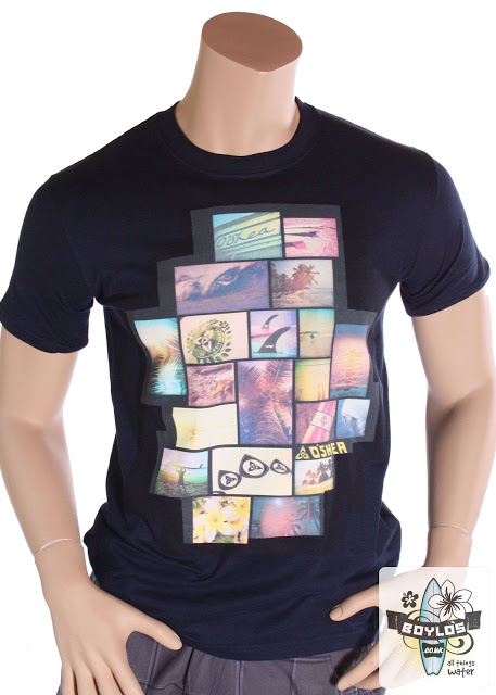
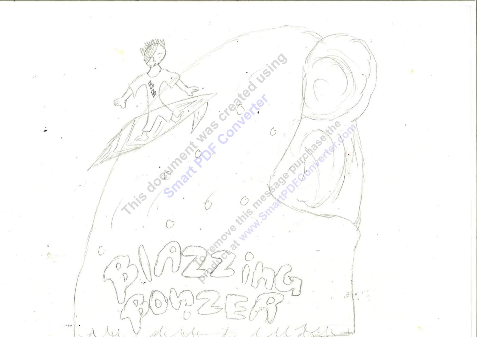
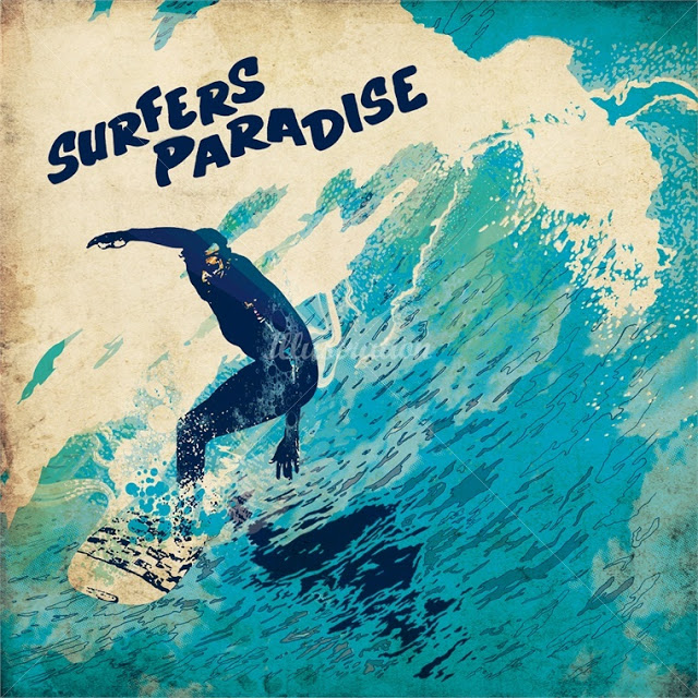
Firstly I found an image on line and upload it onto Photo shop, then I went onto filter and cutout and it basically make the image more broad when it to adding detail to it, but before I cutout the image I fill in the wave and the surfer in a colour that relates to the sea and to surfing so that it will dark tonal silhouette of the surfer which contrasts the background of the image as a whole. Afterwards, I added detail to the waves of the image and I filled the background with a lighter shade of the colour that I used to create the surfer silhouette. Also I used the brush tool to create the outline around the background and the waves of the image. Then I added text onto the background so that the final outcome will be a Chris Ede inspired outcome. 


I used a darker outline around the silhouette so that it will stand out towards the detail  of the  Chris Ede  inspired T-shirt. The comparisons between the Chris Ede illustration and the my Chris Ede inspired T-shirt design are that I used the same colours that are based on surfing, but the differences between the Chris Ede inspired T-shirt design and the Chris Ede illustration are that the Chris Ede uses a rough texture around the background the outline of the surfing illustration. But I used a smooth texture around the background so that I would keep the simple elements of the Chris Ede inspiration . The parts that went well are the use of shapes and colour of the details of the Chris Ede inspired T-shirt design. The parts that I should improve are to enlarge the font of the text of the name of the surfing brand name and not use too much detail towards the waves of the Chris Ede inspired image. 

surfing mood board

In this mood board there is a variety of photos of surfers and surfboards which is the main inspiration of my t-shirt design and my surfing brand as well. The waves in some of the pictures of the mood board are main inspiration of my t-shirt design because the form of the waves helped me with some of the ideas that I created through out the project so far. The parts that went well when I was making my surfing mood board  is the bright colours which reflects the vibrant side of surfing. To improve I should enlarge and add more pictures that are associated  with surfing. 

photo stencil

I done the photo stencil on Photoshop, the way I done the photo stencil is that I upload a photo of Brighton  seaside onto Photoshop. I changed the colour of the image to black and white because it would be easier to create the first layer of the photo stencil. Then I add a new layer to create the second layer of the photo stencil, I deleted the background so that I could another colour that is associated to the beach theme. I add mid tones and highlights of the second layer of the photo stencil to create the image a unique abstract form. After that I add a new layer for the background I chose a light  cold colour for the background because I wanted to the photo stencil of Brighton and the background of the photo stencil. After wards, I found a image of a T-shirt template and I placed the final outcome of the photo stencil onto the T-shirt template. 
The parts that went well the photo stencil T-shirt is the colours that I chose for the stencil of Brighton and the background of the photo stencil which reflects upon the relaxed and peaceful atmosphere of Brighton. The parts I could improve on is to add darker tones around the stencil so that it would look like a photo stencil template of Brighton. The materials and techniques to create the photo stencil are, photographs, hue/saturation, threshold function and the delete function.  

t-shirt montage- Lin Osbourne


Firstly, I found pictures of Brighton, then I dragged the images and put them on Photo shop.  After I put each photo on Photo shop,  I cropped and re size each image so that each of the images that it would be a right scale. Then I open up a new document, I placed the cropped images of Brighton and put them on the document. I arranged and rearranging each image oh the document that is in Photo shop by using a grid. I used the grid to know where each image will go depending on whether the images are the same size or not. After that I found a T-shirt template and I placed the t-shirt montage collage and put it on the t-shirt template. The parts that went well are the  layout each image of Brighton that I found including the Si Scott surfing logo that I made on Illustrator which creates a variety of bright and dull shades of warm and cold colours.


The photos that found of Brighton was based on a photo montage of Brighton and the atmosphere of Brighton is in inspiration of Linn Osbourne. I used a mixed variety of backgrounds that relates to the beach and also relates to surfing as well. I used pictures that I chose has a blend of blues and oranges, I chose these pictures that included those colours is because it gives the outcome of the t-shirt a warm, serene outlet which reflects upon the images in the T-shirt montage. The parts that I could improve on is use more texts in different styles that represents surfing especially waves. as well. The materials and techniques I used to create the Lin Osbourne t-shirt montage are, photographs of Brighton, layers, crop tool, hue and saturation tool and Photo shop.


The artist who created the surfing montage T-shirt is  Lin Osbourne.  Lin Osbourne uses a series of paintings and pictures that are associated to surfing, the paintings and pictures that are associated to surfing that Lin Osbourne used to create the T-shirt montage has a use of light tones of solid and soft colours which creates a natural blend of what each picture of the T-shirt montage represents.  The artist used her techniques effectively by using the pictures and making into the form of the surfing logo. The themes that Lin Osbourne used as inspiration is basically pictures that are based on surfing. I do not like Lin Osbourne's T-shirt montage because she should had  used the images to create the T-shirt montage and make it into the form of a surfboard and also she had used pictures that has more bright and less tonal colours so that it would make the t-shirt look bold and standout. 

oscar wilson t-shirt design


The artist who created the artwork is Oscar  Wilson. Oscar  Wilson  crates a range of illustrations , each of illustrations that he created especially the electric guitar in particular has the names of famous places which then creates a shape that links to the names of the famous places. The artist used a range materials and techniques to produce the range of illustration images such as, cartridge paper to drawn out the shape of the object, tracing paper to trace out the words around the inside of the object that was drawn on to the cartridge paper and Illustrator to produce the outcome of the guitar-shaped calligram logo. The artist has used the techniques effectively by, using the colours  to create a contrast for each part of the calligram image. The theme of this image is music festivals and he comes up with different sorts of music festivals because he wants the names of the music festivals so that it will link to the source of the image. I like his artwork because I like how he uses words or names of places connect to certain type of object or animal or even describing a certain type of person. 
I first drawn a silhouette of a surfer and a surfboard onto cartridge paper with a pencil. Then I  wrote down words that relates to surfing in the surfer and surfboard silhouette, afterwards, I traced the words that in the silhouette using both fine liner and tracing paper. After that I scanned the calligram image on to computer and dragged the image on to Illustrator then I used the live trace tool to trace around the words that are in the silhouette image. When I've done live tracing  of the calligram image I used the paint bucket tool to fill in the spaces within the calligram logo. Then I found a image of a t-shirt after I found a t-shirt or a t-shirt template I  finally dragged the calligram logo and I placed the logo onto the t-shirt template image.  The parts that went well are use of texts that I used to create the shape and form of the calligram logo. I could improve the calligram logo by enlarging the scale of the logo and fill in the spaces of the logo by adding more colour or text to it. The materials and techniques I used to create the Oscar Wilson inspired calligram design are, colour range, tracing paper,
Photo shop, Illustrator, fine liner, text tool and paint bucket tool.


silhouette t-shirt design


I first I found an image of a surfer silhouette, then I upload it onto Photo shop. After that I  found an image of  waves  then I also upload the image of the waves onto Photo shop. Then I copy and paste a piece of text and placed on top the wave image then I dragged  the text waved  background and placed on top of the surfing silhouette. Finally I found an image of t-shirt template and I upload it on to Photo shop, then I dragged the surfing silhouette on top of the t-shirt template. The materials and techniques I used to create the surfing silhouette are, Photo shop where I mostly to produce the surfing silhouette t-shirt, hue and saturation tool to make the silhouette more vibrant and colourful, brightness and contrast tool to make the text of the silhouette even out and I used the magic wand tool to delete the background the original version of the surfer silhouette. The parts that went well are the choice of the text which relates to waves and surfing. The parts that I should improve on are to try to make the text stand out  and use the hue and saturation tool to make the silhouette have more tropical beach effect.

si scott t-shirt design


I first drawn out the Si Scott inspired drawing text on to cartridge paper, then I drawn out different sorts  lines of lines and  shapes around the text. After wards, I used bright and cool colors for the font , the lines and shapes and the outlines of the shapes of the Si Scott inspired drawing because I wanted the drawing to be very vibrant but versatile at the same time. Then I taken a picture the hand made Si Scott version and upload it onto Photo shop. Finally I used the paint brush tool to paint around the areas around the font ,shapes and  lines of hand made Si Scott version so that it will look stand out and also look really clear at the same time. The parts that went well are the choice of color and vibrant lines around the areas of the font and other parts of the drawing. To improve  I should enlarge the font so that and I could try to add more detail around the Blazzing Bonzer font and also fill up areas around blank spaces of the cartridge paper. 
The artist who created the typography is Si Scott. Si Scott creates a style of text and also he uses free form lines  to extend the letters of the bold font. He also free form lines to unique form detail around the font. The materials or media Si Scott uses to create the typography illustrations are tracing paper, cartridge paper and fine liner. The techniques Si Scott used are Illustrator and photo shop. he uses Illustrator to the curved lines around the font, the tool he used to create the typography on Illustrator are the curved line tool and the warped tool as well. The artist used photo shop to add bright colours to the typography.  The artist has used the techniques effectively by the way the artist uses the tool on Illustrator to create the typography outcome. The theme that the artist used is being expression which reflects upon the amount of detail used for the font of the typography illustration. I like the artist artwork because I like how he uses bright colours and curved lines which a bold versatile outcome. 

I first I went onto Illustrator and then I went onto the text tool and typed  'Blazzing Bonzer'  in  center of the page . After that, I used the warp and twirl tool to create curved waves around the text so it will look like the text is inspired by the shape of  waves. Then I used the shape and the paint bucket tool to start off on making  the waves that are placed around the text, then I used the warp and twirl tool again to start creating the form and shape of the colorful waves of the Si Scott inspired logo. Finally I found a T-shirt template then I upload it on to Photo shop. Afterwards, I dragged  the Si Scott inspired logo and placed it on top of the t-shirt template. The parts that went well are, the form of waves that were around the font. I should improve on is to place the colorful waves around the right places of the font so that it will look like different styles of waves. 

Sunday 28 October 2012

t-shirt evaluation

I used different sorts of techniques and materials through out the project. The artist that inspired me for my final outcome of the T-shirt surfing project is both Si Scott and Oscar Wilson because they both not just use text in their artwork or illustrations or even their T-shirt designs is because they use their skills to create different styles of text. I also did a surfing mood board which the pictures of the mood board is range of surfers, surfboards and surfing costumes. The parts the project that went well are the Si Scott typography inspired logo and the mind map of ideas of names of my surfing brand . The reason why the Si Scott typography inspired logo went well is because I can use different sorts of tools such as warp tool to create free flowing wave patterns and shapes around the font when I was on Illustrator creating the digital Si Scott t-shirt design. And the parts that I struggled on was the digital version of the silhouette T-shirt design because I didn't have enough time to understand what I was doing when I was making the silhouette T-shirt design on Photo shop. The materials and techniques mostly are, tracing paper, fine liner, cartridge paper, Photoshop and Illustrator. The similarities between  my Si Scott's inspired typography logo and Oscar Wilson's inspired calligram logo is the use of bright colors that I used for each logo. The artwork that is the most effective is my  Oscar Wilson's calligram inspired logo because I used different styles of fonts to create the form of a silhouette of a surfer. The pieces that I will use for my final T-shirt outcome is either the silhouette and Si Scott's inspired logo or my Oscar Wilson's inspired calligram logo. I would like to use either of the pieces for my final outcome because I want my surfing to be targeted to both female and male surfing audience and I want to make my final T-shirt outcome to be effective towards my target market.

Monday 15 October 2012

surfing worksheet


This is the work sheet I've done in class and basically I have to match each surfing logo with the different types of logos and definitions of the different types of logos. And the matches are,
Combination Mark - a logo which combines a word-mark and a symbol-O'Neill
Brand-mark Symbol- a symbol representing the  company, the name of which is often the company name-Gul
Letter-mark-a typographic logo using initials which represent the company or brand name- Vauxwagon
Emblem- a logo which encases the company name within a shape or object-Roxy
Word-mark- a typographic logo that spells out the company or brand name- Surf Sistas OTB
Abstract- a symbol which represents the company but is seemingly random- Sirens Surf


Thursday 4 October 2012

Blazzing Bonzer logo

This is my final Blazzing Bonzer logo , I produced and add in  colours of the logo with Photoshop, when i actually produced the actual logo onto bags and t-shirts i should add every detail onto the logo and make the logo more wider so that I could make the logo more adaptable.

I am not happy with my final logo because the font doesn't go well with logo. What works well is the wave which is in shape of a 'B' which is the initials of my surfing logo. The improvements that I could work on to make my logo look better is, by changing the font and make the boy surfer look more of an actual professional surfer. The surfer logo that inspired me was O'Neill because the typography of the logo helped me created the 'B' shaped wave.

Blazzing Bonzer (draft version)

These is the draft version of my Blazzing Bonzer logo that I traced off from my Blazzing Bonzer initial design ideas. I decided not add both the girl and the boy surfers because it looked like I added too much detail towards the logo,but I am adding the girl and boy surfers onto my t-shirt design because it will make look like the Blazzing Bonzer logo and name is based on a unisex surfer brand.

blazzing bonzer logo ideas

 These are the designs of my surfing brand name which is called Blazzing Bonzer and basically the fonts and the colors within the logos of my surfing brand name is based on people such as ,surfers and what people see at the beach or at the seaside. Next time I should add more of my designs that I drawn for my Blazzing Bonzer brand name.

surf project research

I did a mind map of names of my ideal surfer brand name, I did the topic of the mind map in a shape of surf board because it is relevant to research that I'm doing of my brand name. Next time i should add other topics of my surfer brand research especially the names of the actual surfing brand logos and names of the surfing brand logos.

surfer logo icons

   These are drawings that would help me produce a range of surfing brand logos. Next time I should add more darker tone towards the drawings and include every single bit of my surfer logo icons. They helped produced a range of surfing logos, the drawings  that helped create my final logo are the waves and the surfer on the surfboard.

surfer brand logo notes

What makes a good logo?

  • bold fonts 
  • clear symbols
  • reflects company 
  • children's fonts should use images in a cartoon style 
  • color symbolism
  • color choice is key
  • serious-muted
  • playful/fun - brights
  • surfing logos- different shades of blue
  • it sent's  out a message
  • clever logo- hidden parts 
  • it takes longer to work out the meaning behind the logo
  • memorable brand association
  • a logo should make a quick time pace so it look more simple