Sunday 28 October 2012
t-shirt evaluation
I used different sorts of techniques and materials through out the project. The artist that inspired me for my final outcome of the T-shirt surfing project is both Si Scott and Oscar Wilson because they both not just use text in their artwork or illustrations or even their T-shirt designs is because they use their skills to create different styles of text. I also did a surfing mood board which the pictures of the mood board is range of surfers, surfboards and surfing costumes. The parts the project that went well are the Si Scott typography inspired logo and the mind map of ideas of names of my surfing brand . The reason why the Si Scott typography inspired logo went well is because I can use different sorts of tools such as warp tool to create free flowing wave patterns and shapes around the font when I was on Illustrator creating the digital Si Scott t-shirt design. And the parts that I struggled on was the digital version of the silhouette T-shirt design because I didn't have enough time to understand what I was doing when I was making the silhouette T-shirt design on Photo shop. The materials and techniques mostly are, tracing paper, fine liner, cartridge paper, Photoshop and Illustrator. The similarities between my Si Scott's inspired typography logo and Oscar Wilson's inspired calligram logo is the use of bright colors that I used for each logo. The artwork that is the most effective is my Oscar Wilson's calligram inspired logo because I used different styles of fonts to create the form of a silhouette of a surfer. The pieces that I will use for my final T-shirt outcome is either the silhouette and Si Scott's inspired logo or my Oscar Wilson's inspired calligram logo. I would like to use either of the pieces for my final outcome because I want my surfing to be targeted to both female and male surfing audience and I want to make my final T-shirt outcome to be effective towards my target market.
Monday 15 October 2012
surfing worksheet

This is the work sheet I've done in class and basically I have to match each surfing logo with the different types of logos and definitions of the different types of logos. And the matches are,
Combination Mark - a logo which combines a word-mark and a symbol-O'Neill
Brand-mark Symbol- a symbol representing the company, the name of which is often the company name-Gul
Letter-mark-a typographic logo using initials which represent the company or brand name- Vauxwagon
Emblem- a logo which encases the company name within a shape or object-Roxy
Word-mark- a typographic logo that spells out the company or brand name- Surf Sistas OTB
Abstract- a symbol which represents the company but is seemingly random- Sirens Surf
Thursday 4 October 2012
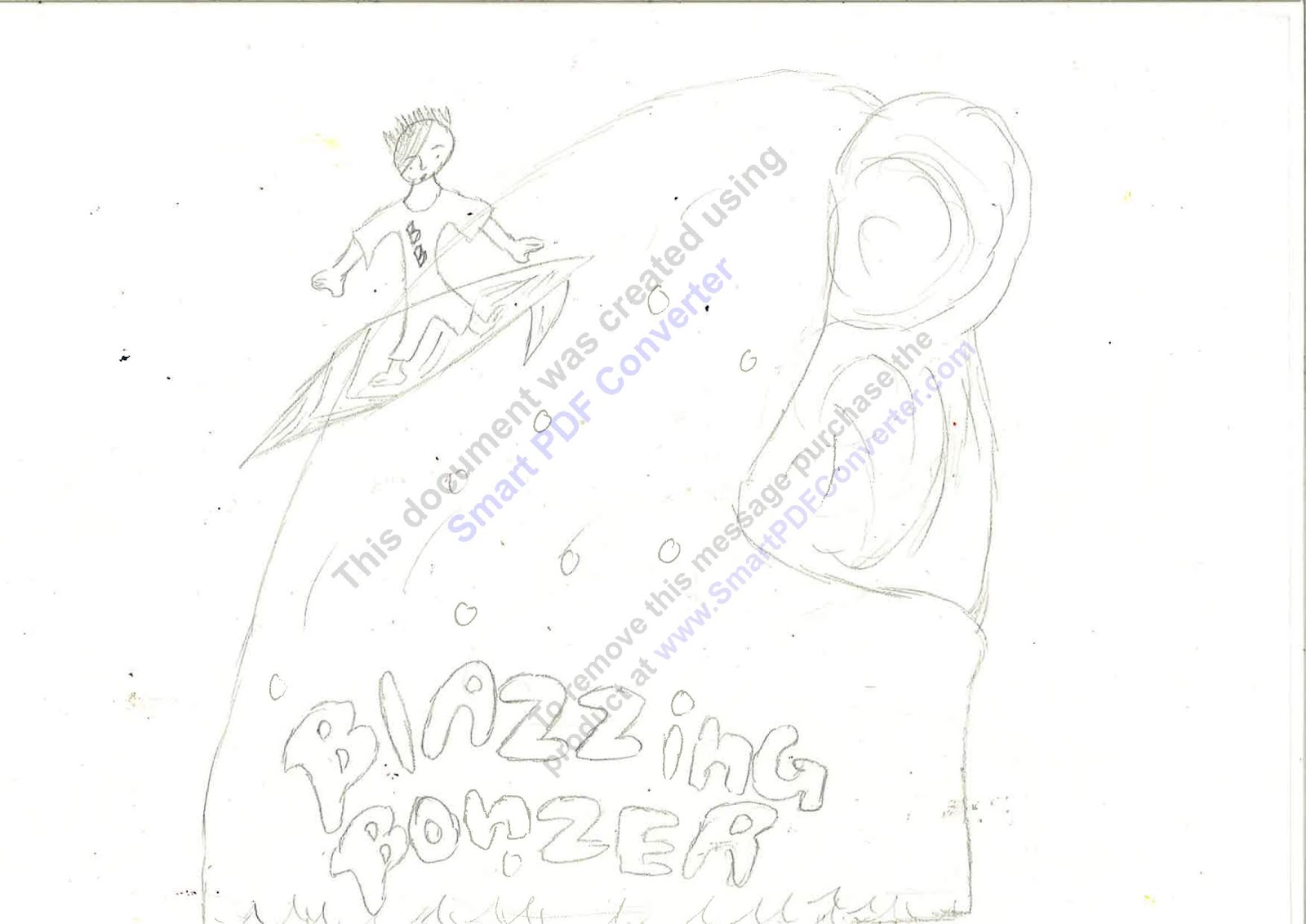
Blazzing Bonzer logo

I am not happy with my final logo because the font doesn't go well with logo. What works well is the wave which is in shape of a 'B' which is the initials of my surfing logo. The improvements that I could work on to make my logo look better is, by changing the font and make the boy surfer look more of an actual professional surfer. The surfer logo that inspired me was O'Neill because the typography of the logo helped me created the 'B' shaped wave.
Blazzing Bonzer (draft version)
blazzing bonzer logo ideas

surf project research

surfer logo icons

surfer brand logo notes
What makes a good logo?
- bold fonts
- clear symbols
- reflects company
- children's fonts should use images in a cartoon style
- color symbolism
- color choice is key
- serious-muted
- playful/fun - brights
- surfing logos- different shades of blue
- it sent's out a message
- clever logo- hidden parts
- it takes longer to work out the meaning behind the logo
- memorable brand association
- a logo should make a quick time pace so it look more simple
Subscribe to:
Posts (Atom)