
Wednesday, 6 February 2013
Animated GIF
inspiring stop motion
Address Is Approximate from The Theory on Vimeo.
I chose this video because I like how the person that created the stop motion video who is Tom Jenkins used different locations from the computer and toys to make the concept of the world's tiniest police chase. This video is inspiring by how Tom Jenkins use innovative and unique ideas for the stop motion video especially the part in the video where background on the computer change to a bridge and make the animation look like the toy is driving underneath the bridge with using the toy car, also the lamps that created a spinning movement looked like police sirens. The type of animation is a Google street view stop motion, the props and techniques that he used are mostly toys and Google street view. The techniques that he used were taking pictures of the places from Google street view which created an illusion that the toy was the driving the toy car through the places that were shown on the computer screen. The things that I could try in my own work that is inspired by the video is to create an unique outcome that links towards the lyrics for my stop motion video and create an illusion or a movement in the text which will make the stop motion video interesting and in timing with the song that I chose for my stop motion video.
Nowhere Near Here from Pahnl on Vimeo.
I chose this video because I like how the video took a creative approach of a dog running in the city of London at night. This video is inspiring by how Pahnl took so much time and dedication into making the video which turned to an outstanding outcome. The props and techniques that he used into making the stop motion video are, stencils and exposure photography, the way he uses the techniques in the stop motion video are he drawn stencils of the animals that he chose for the video and then he creates light in the stencils by using exposure photography. Which makes the stencils look like bright illuminate cartoon street art animals.The things that I could try in my own work that is inspired by the video is to add bright colourful photos in the middle of my stop motion video so that it creates a different outlook towards the final outcome of the stop motion video.
The PEN Story from PENStory on Vimeo.
I chose this video because I like how the pictures became into a movement that made it look like the photos from the stop motion video came to life. This is inspiring how the pictures tell a story which made the pictures look live like, the props and techniques that have been used in the video were that the pictures from the video was shot each time to create the movement of the photos which gave the video a realistic form. The things that I could try in my own work that is inspired by the video is to take pictures of the text that I created for my own stop motion video and add creative techniques to them so that the video will turn out original yet unique.
Monday, 4 February 2013
stop-motion comparison
Death Cab for Cutie - Little Bribes from Ross Ching on Vimeo.
Hudson - Against The Grain from Dropbear on Vimeo.
The artists who created the stop-motion animation videos uses a range of different props or materials that relates to music or the concept that the music is playing in the background of the two videos. The artist that created Against The Grain experimented with using colouring pencils, the artist use of the materials relates to lyrics by the way the artist used the colouring pencils in many different ways such as, the movement of the waves with the pencils and how the artist uses different colours of the colouring pencils that represented the use of lyrics of the video. The artist that created the Against The Grain video is Jonathan Chang. The artist has used the techniques effectively by how uses the colouring pencils to creates a different prescriptive each time which creates a outlook of what the video is about. I don't like the video as much because the artist should use others ways to express what he is feeling through the lyrics of the video by using different materials or techniques.
The artist who created the Little Bribes video is Ross Ching. The techniques that he used to create the video was time lapsing each still shot of typography that he experimenting with by finding objects or places to write the typography. The artist has used the techniques effectively by how he uses the cityscape for the background and the main source of the typography also the way the artist makes the video is the way he uses the different sorts of styles of fonts for the typography. Also he uses his use of props to make words from the Little Bribes video which makes it look uniquely different. Also he uses them to represent the cityscape at night, I like how uses different places in the city to create the different types of typography which creates the uniqueness of it.
Friday, 1 February 2013
food animation -tea
The items that I used to create the animation are tea bags and nuts. I used iMotion to create the concept of the animation, I used the tea bags to create the theme but also using to create the teapot and the cup, I also used nuts to create the illusion that the tea is pouring from the teapot and into the cup. Before I created the animation I created a mind map of ideas of the food items that I chose. I created the iMotion animation on the ipad. I enjoyed using these techniques because with iMotion I can use the items that I chose and create different types concepts and making into one concept when it is put together. My idea of my chosen food item is effective because the food item that I mainly chose is tea can be made into many different ways but the concept that I chose shows how the tea has been made or produced. I can improve my animation by adding features to the tea bags so that it will had a sense creativity towards the animation.
time lapse animation
My time lapse animation is effective by how the speed of making the process of drawing of the water bottle is done at the short amount of time. The materials and equipment that I used are, oil pastels, iPad and card, the technique that I used to create the time lapse animation of the drawing of the water bottle is iMotion. I liked the use of techniques by how each picture that I took from the iPad and it turned into a process of drew the water bottle from my previous drawing of the water bottle. The parts that I found difficult was taking the pictures of my drawing whilst I was drawing the image of the bottle. I would like to work on them again but I would use different materials to make the animation more creative and presentable.
Wednesday, 23 January 2013


Monday, 7 January 2013
final t-shirt outcome
 |
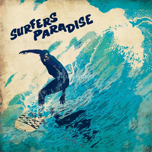
| This is drawing that I done that I began to get fully developed on Photoshop. The changes that I made to the final outcome was, I set the colours for the background in a darker tone so that waves and the surfer silhouettes will be the main focus of the design. I add a white thick line across the background of the design so that it look like a tide of a wave, I used the paint brush tool to create thin lines around wave of the design. Also I changed the font of the design because it relates to the theme or the concept of the design. |
 |
My t-shirt is aimed at young teens who are interested in surfing or enjoyed doing surfing for a living or a hobby. I chose this design because the colours are not too bright which makes the logo of my brand stand out also I chose this design because the two surfer silhouettes shows that the design appeals to both young male and female teens. The materials and techniques that I used were fine liner, colouring pencils and pens to create the t-shirt design and I used photo shop to develop the t-shirt design a bit more further. I took one of flowers from the design and create a halfway boarder around the design so that the logo will be the main focus of the t-shirt outcome. To make the design a bit more developed or improved is to add more colour around the background and the silhouettes of the design. The artist and designer that inspired me is Chris Ede because the way he uses different techniques and materials helped me develop towards my final outcome. The comparisons between the Chris Ede illustration and my final outcome is the dark tonal shades around the waves but the differences are the Chris Ede illustration has a simmery reflection of the surfer whereas my final outcome has a solid silhouettes of the two surfers.
 |
 |
I used my first logo as my inspiration because it was an development from the first logo to final outcome that a chose for my t-shirt design. I also developed my first logo by adding the female surfer but I made the female and male surfers into silhouettes. The other developments that I made from my logo design was, changing the waves into a different shade of colour but lighter because it drawns in to the details of the waves and the boldness of the background of the design. The differences between the development of the Blazzing Bonzer logo and the original logo is, I changed the font of the developed logo so that it relates the theme of the brand of the logo and I made the tide of the waves look faded because I wanted to make the texture of the waves a bit smooth and settle. The similarities between the developed logo and the original logo is I kept the tide of the wave in shape of a b because it is the initials of the logo.
|
Subscribe to:
Posts (Atom)