


 |
| This is drawing that I done that I began to get fully developed on Photoshop. The changes that I made to the final outcome was, I set the colours for the background in a darker tone so that waves and the surfer silhouettes will be the main focus of the design. I add a white thick line across the background of the design so that it look like a tide of a wave, I used the paint brush tool to create thin lines around wave of the design. Also I changed the font of the design because it relates to the theme or the concept of the design. |
 |
My t-shirt is aimed at young teens who are interested in surfing or enjoyed doing surfing for a living or a hobby. I chose this design because the colours are not too bright which makes the logo of my brand stand out also I chose this design because the two surfer silhouettes shows that the design appeals to both young male and female teens. The materials and techniques that I used were fine liner, colouring pencils and pens to create the t-shirt design and I used photo shop to develop the t-shirt design a bit more further. I took one of flowers from the design and create a halfway boarder around the design so that the logo will be the main focus of the t-shirt outcome. To make the design a bit more developed or improved is to add more colour around the background and the silhouettes of the design. The artist and designer that inspired me is Chris Ede because the way he uses different techniques and materials helped me develop towards my final outcome. The comparisons between the Chris Ede illustration and my final outcome is the dark tonal shades around the waves but the differences are the Chris Ede illustration has a simmery reflection of the surfer whereas my final outcome has a solid silhouettes of the two surfers.
 |
 |
I used my first logo as my inspiration because it was an development from the first logo to final outcome that a chose for my t-shirt design. I also developed my first logo by adding the female surfer but I made the female and male surfers into silhouettes. The other developments that I made from my logo design was, changing the waves into a different shade of colour but lighter because it drawns in to the details of the waves and the boldness of the background of the design. The differences between the development of the Blazzing Bonzer logo and the original logo is, I changed the font of the developed logo so that it relates the theme of the brand of the logo and I made the tide of the waves look faded because I wanted to make the texture of the waves a bit smooth and settle. The similarities between the developed logo and the original logo is I kept the tide of the wave in shape of a b because it is the initials of the logo.
|
 |
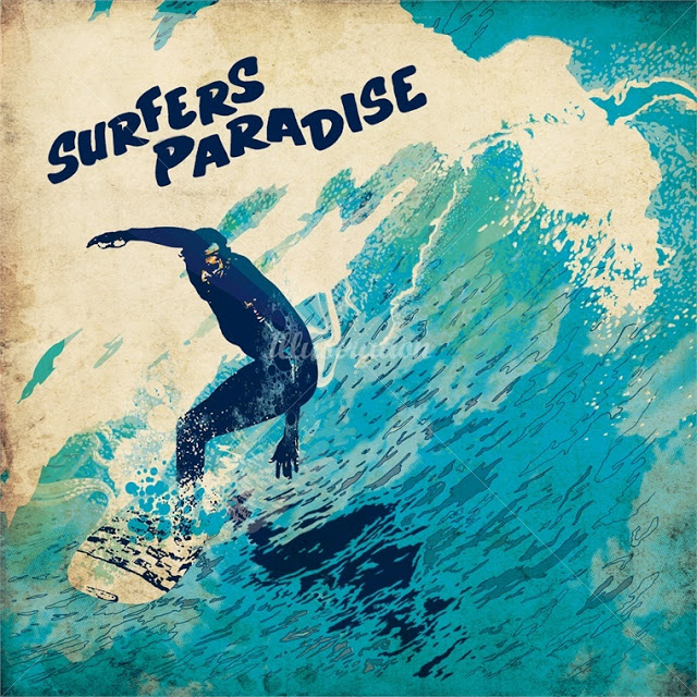
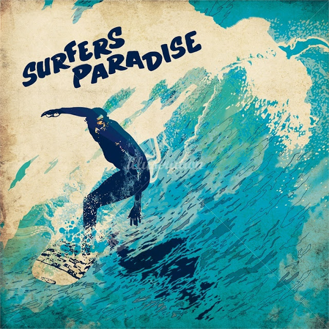
| Firstly I found an image on line and upload it onto Photo shop, then I went onto filter and cutout and it basically make the image more broad when it to adding detail to it, but before I cutout the image I fill in the wave and the surfer in a colour that relates to the sea and to surfing so that it will dark tonal silhouette of the surfer which contrasts the background of the image as a whole. Afterwards, I added detail to the waves of the image and I filled the background with a lighter shade of the colour that I used to create the surfer silhouette. Also I used the brush tool to create the outline around the background and the waves of the image. Then I added text onto the background so that the final outcome will be a Chris Ede inspired outcome. |
 |
| I used a darker outline around the silhouette so that it will stand out towards the detail of the Chris Ede inspired T-shirt. The comparisons between the Chris Ede illustration and the my Chris Ede inspired T-shirt design are that I used the same colours that are based on surfing, but the differences between the Chris Ede inspired T-shirt design and the Chris Ede illustration are that the Chris Ede uses a rough texture around the background the outline of the surfing illustration. But I used a smooth texture around the background so that I would keep the simple elements of the Chris Ede inspiration . The parts that went well are the use of shapes and colour of the details of the Chris Ede inspired T-shirt design. The parts that I should improve are to enlarge the font of the text of the name of the surfing brand name and not use too much detail towards the waves of the Chris Ede inspired image. |
 |
| In this mood board there is a variety of photos of surfers and surfboards which is the main inspiration of my t-shirt design and my surfing brand as well. The waves in some of the pictures of the mood board are main inspiration of my t-shirt design because the form of the waves helped me with some of the ideas that I created through out the project so far. The parts that went well when I was making my surfing mood board is the bright colours which reflects the vibrant side of surfing. To improve I should enlarge and add more pictures that are associated with surfing. |
 |
| I done the photo stencil on Photoshop, the way I done the photo stencil is that I upload a photo of Brighton seaside onto Photoshop. I changed the colour of the image to black and white because it would be easier to create the first layer of the photo stencil. Then I add a new layer to create the second layer of the photo stencil, I deleted the background so that I could another colour that is associated to the beach theme. I add mid tones and highlights of the second layer of the photo stencil to create the image a unique abstract form. After that I add a new layer for the background I chose a light cold colour for the background because I wanted to the photo stencil of Brighton and the background of the photo stencil. After wards, I found a image of a T-shirt template and I placed the final outcome of the photo stencil onto the T-shirt template. |
 |
| The parts that went well the photo stencil T-shirt is the colours that I chose for the stencil of Brighton and the background of the photo stencil which reflects upon the relaxed and peaceful atmosphere of Brighton. The parts I could improve on is to add darker tones around the stencil so that it would look like a photo stencil template of Brighton. The materials and techniques to create the photo stencil are, photographs, hue/saturation, threshold function and the delete function. |
 |
 |
| The photos that found of Brighton was based on a photo montage of Brighton and the atmosphere of Brighton is in inspiration of Linn Osbourne. I used a mixed variety of backgrounds that relates to the beach and also relates to surfing as well. I used pictures that I chose has a blend of blues and oranges, I chose these pictures that included those colours is because it gives the outcome of the t-shirt a warm, serene outlet which reflects upon the images in the T-shirt montage. The parts that I could improve on is use more texts in different styles that represents surfing especially waves. as well. The materials and techniques I used to create the Lin Osbourne t-shirt montage are, photographs of Brighton, layers, crop tool, hue and saturation tool and Photo shop. |
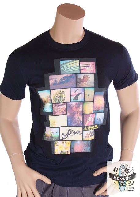 |
| The artist who created the surfing montage T-shirt is Lin Osbourne. Lin Osbourne uses a series of paintings and pictures that are associated to surfing, the paintings and pictures that are associated to surfing that Lin Osbourne used to create the T-shirt montage has a use of light tones of solid and soft colours which creates a natural blend of what each picture of the T-shirt montage represents. The artist used her techniques effectively by using the pictures and making into the form of the surfing logo. The themes that Lin Osbourne used as inspiration is basically pictures that are based on surfing. I do not like Lin Osbourne's T-shirt montage because she should had used the images to create the T-shirt montage and make it into the form of a surfboard and also she had used pictures that has more bright and less tonal colours so that it would make the t-shirt look bold and standout. |
 |
| The artist who created the artwork is Oscar Wilson. Oscar Wilson crates a range of illustrations , each of illustrations that he created especially the electric guitar in particular has the names of famous places which then creates a shape that links to the names of the famous places. The artist used a range materials and techniques to produce the range of illustration images such as, cartridge paper to drawn out the shape of the object, tracing paper to trace out the words around the inside of the object that was drawn on to the cartridge paper and Illustrator to produce the outcome of the guitar-shaped calligram logo. The artist has used the techniques effectively by, using the colours to create a contrast for each part of the calligram image. The theme of this image is music festivals and he comes up with different sorts of music festivals because he wants the names of the music festivals so that it will link to the source of the image. I like his artwork because I like how he uses words or names of places connect to certain type of object or animal or even describing a certain type of person. |
 |
| I first drawn a silhouette of a surfer and a surfboard onto cartridge paper with a pencil. Then I wrote down words that relates to surfing in the surfer and surfboard silhouette, afterwards, I traced the words that in the silhouette using both fine liner and tracing paper. After that I scanned the calligram image on to computer and dragged the image on to Illustrator then I used the live trace tool to trace around the words that are in the silhouette image. When I've done live tracing of the calligram image I used the paint bucket tool to fill in the spaces within the calligram logo. Then I found a image of a t-shirt after I found a t-shirt or a t-shirt template I finally dragged the calligram logo and I placed the logo onto the t-shirt template image. The parts that went well are use of texts that I used to create the shape and form of the calligram logo. I could improve the calligram logo by enlarging the scale of the logo and fill in the spaces of the logo by adding more colour or text to it. The materials and techniques I used to create the Oscar Wilson inspired calligram design are, colour range, tracing paper, Photo shop, Illustrator, fine liner, text tool and paint bucket tool. |
